Case study · Web3 / DeFi Investment Platform
Common Wealth
Democratizing wealth in the Web3 ecosystem.
01
Introduction & project context
- Product
- Common Wealth — a Web3/DeFi investment platform granting retail investors early-stage access to seed-round projects, a privilege traditionally reserved for Venture Capital funds.
- Goal
- Architect an advanced yet accessible financial ecosystem by stripping away the complexity and friction inherent to cryptocurrency platforms.
- My Role
- Lead UX Designer — driving the product from the initial discovery workshops, through prototyping, to Open Beta and launch.
- Timeline
- From concept to launch in just 11 weeks (kickoff August 2022).
- Team
- A cross-functional squad of 1 PM, 5 Developers, 1 DevOps, and 2 UX Designers.
The challenge
Traditional crypto platforms are notoriously user-unfriendly, assuming everyday individuals understand cryptic tokenomics, heavy technical jargon, and blockchain networks. My mission was to translate abstract business concepts and advanced financial engineering into an intuitive, secure product that educates users and builds immediate trust.
02
Discovery: from kickoff workshops to first blueprints
Cross-functional user journey mapping
As Lead UX, I co-facilitated the core Product Discovery Workshops. The focus was aligning the cross-functional squad and scoping out the MVP through detailed user story mapping — turning a complex Web3 vision into a shared, actionable plan.
Rapid visualization
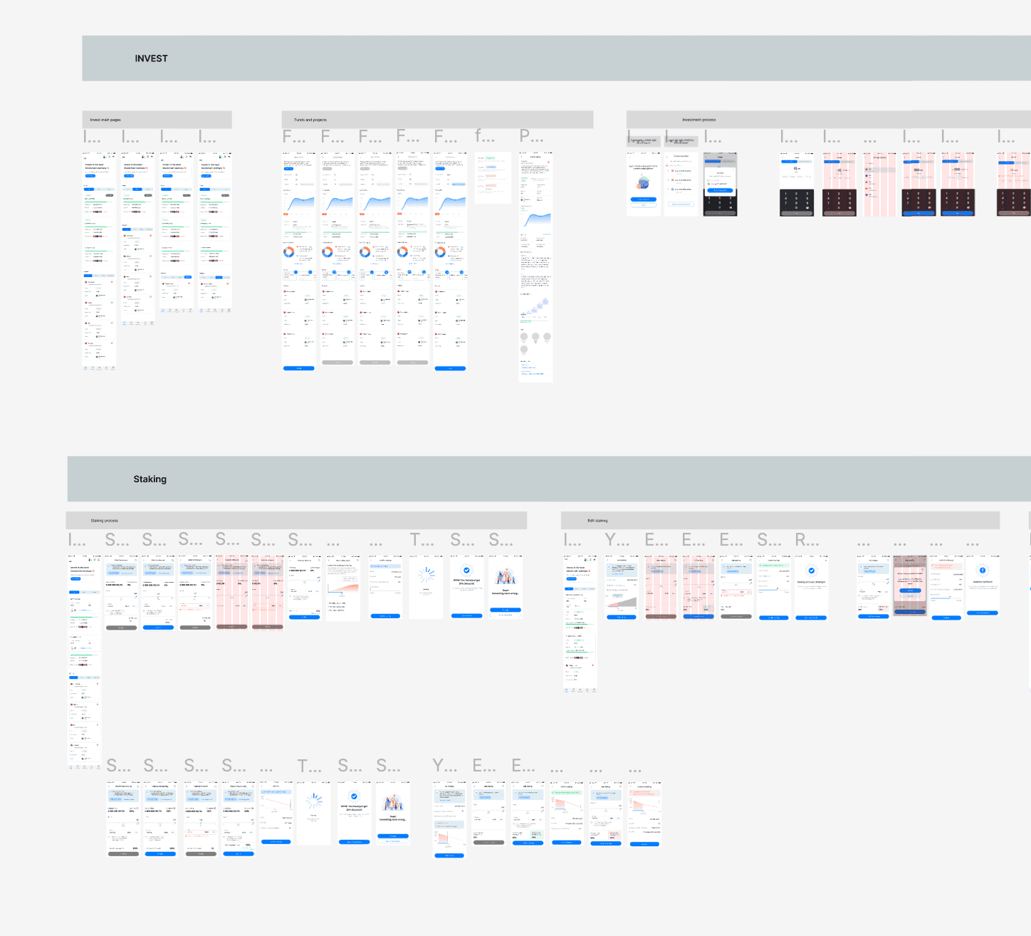
Immediately following the workshops, I transformed raw functional logic and system architecture into low-fidelity mockups — letting the entire team instantly visualize the product's layout and its engineering constraints.
03
UX research: lowering the barrier to entry
Early-stage usability testing
I ran targeted usability tests on low-fi prototypes with a deliberately mixed cohort: Web3-savvy stakeholders from the client side, and agency team members with zero prior crypto knowledge. The crucial insight was clear — relying solely on standard crypto wallets like MetaMask completely alienated and blocked newcomers.
The solution · a hybrid onboarding framework
04
A bold brand, made usable
Applying a distinctive crypto identity
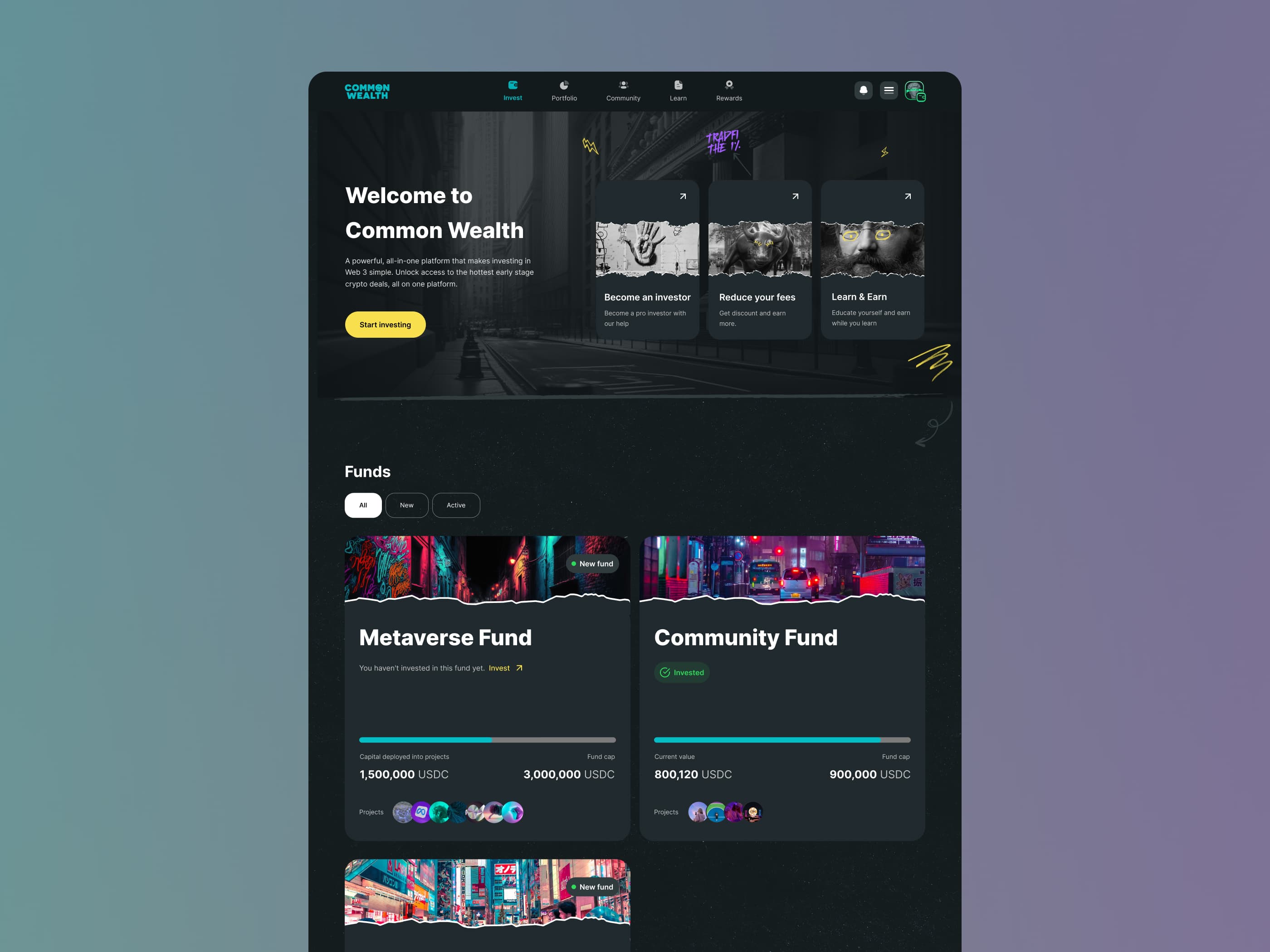
Common Wealth came with a bold, unapologetic brand — neon accents, torn-paper edges, and street-art energy. My job was to apply that identity consistently across every screen while keeping the product calm and trustworthy enough to handle real money. I built a design system that let the aesthetic stay loud without ever getting in the way of the financial task at hand.
The investor's home base
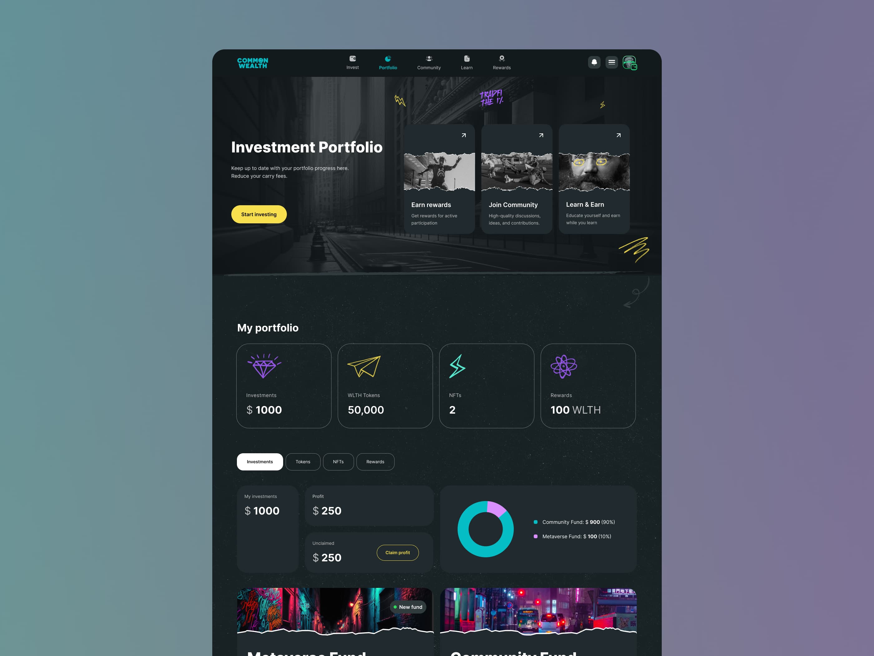
After logging in, users land on their investment portfolio — the product's home. I designed it to surface everything that matters at a glance: active investments, WLTH tokens, NFTs, rewards, and profit, with carry fees always in view.
05
Process engineering: a unique staking architecture
Disrupting the staking standard
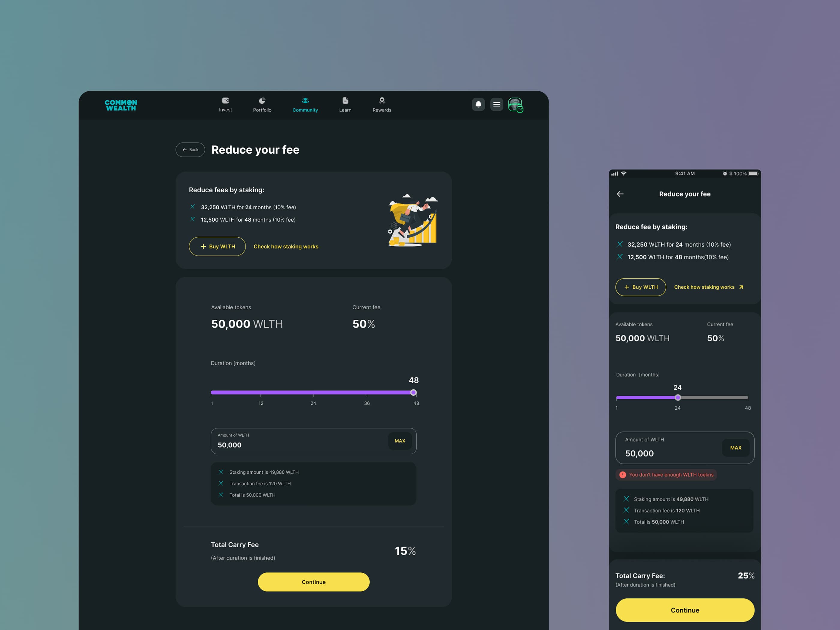
Unlike typical solutions where staking simply pays out passive interest, Common Wealth introduced a different business model: users lock their WLTH tokens to earn carry-fee discounts when withdrawing profits from investment funds.
Making the value loop tangible
The challenge was communicating this value loop clearly. I designed a clean financial calculator and visual pathway so users could immediately grasp the correlation: tokens staked = fees saved = higher net profit. To build instant mental models, I drew on UI patterns users already trust — traditional banking apps and digital leasing calculators.
06
Gamification & rewards
The mission engine
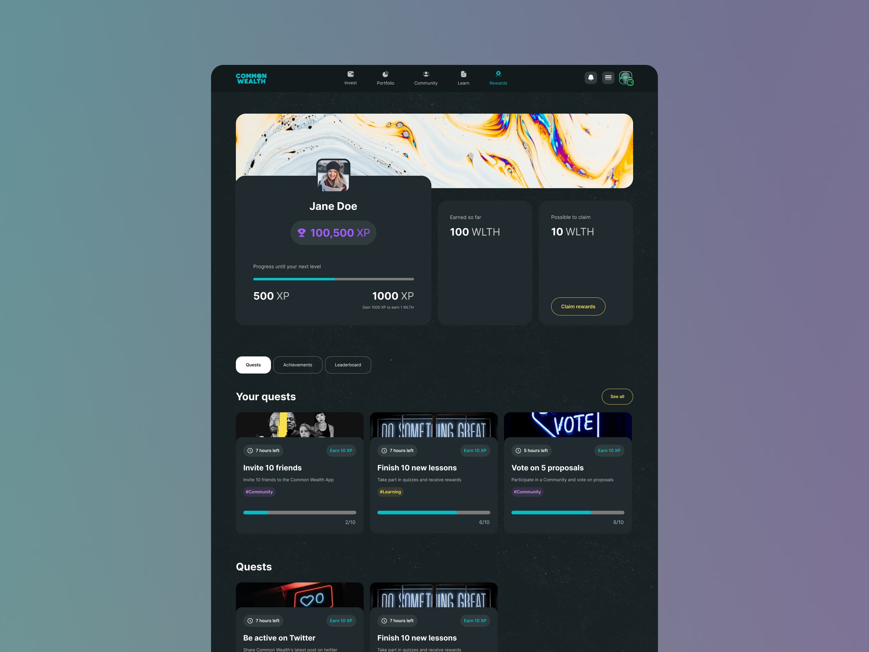
I designed an immersive gamification system built around interactive community missions — onboarding tasks and educational quests — where users earn experience points (XP), level up, and unlock exclusive WLTH rewards. It turned learning the platform into a habit and fueled organic, viral growth.
07
Community at the core
Transparency builds trust
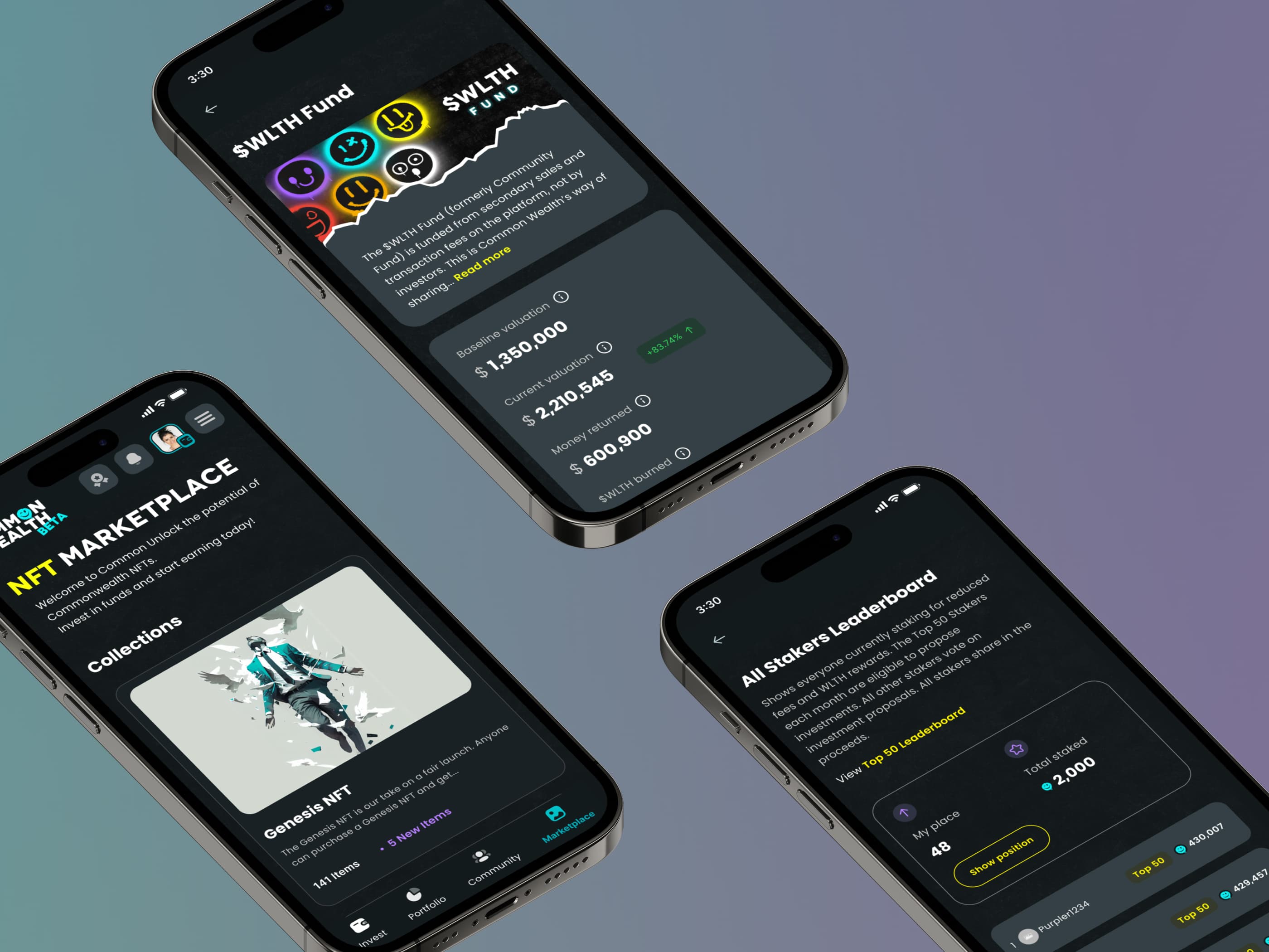
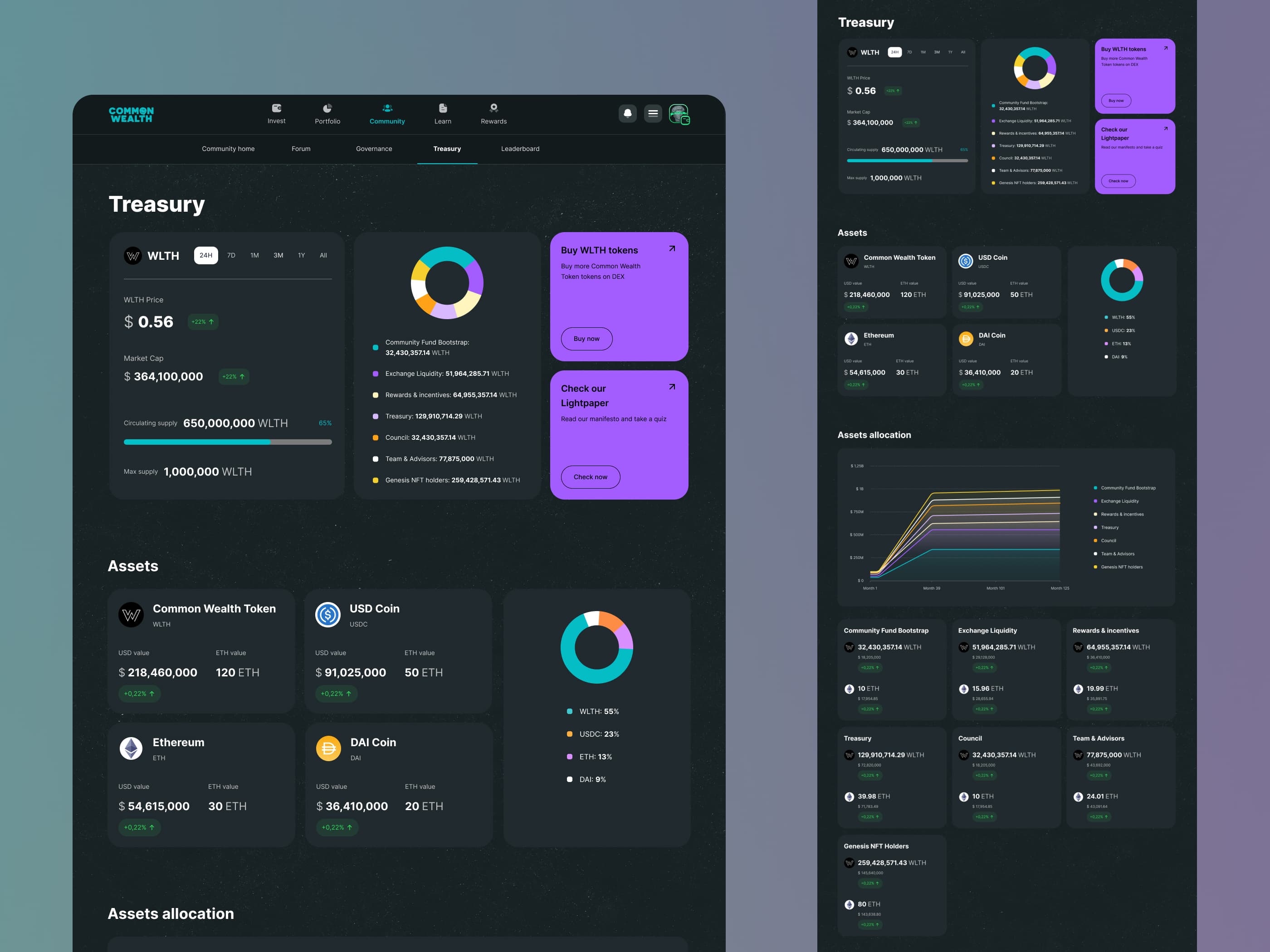
For a crypto project, community is everything — and trust is earned through transparency. I designed the Treasury as an open window into the protocol: WLTH price, market cap, circulating supply, and a full breakdown of assets and allocation, so the community could always see exactly how the fund was managed.
08
Impact & results
The business impact
Moving from initial concept to launch in just 11 weeks, the system recorded over 70,000 completed missions within the first 3 days of going live — driving exceptional market feedback and proving that intentional, inclusive design can make Web3 genuinely accessible.
“I really have to admit that I enjoy completing the tasks! I never had that feeling on Gleam or the other websites. The design also makes it even more attractive. Very well done. Hats off to the team.”
Up next